
But most of the critics have overstated their case pretty severely here. The Case-Deaton result is not bunk - it's a real and striking finding.
Harris and Geronimus' Critique
Harris and Geronimus' Critique
First, let's talk about the most popular critique - Malcolm Harris' post in the Pacific Standard. Josh Zumbrun of the Wall St. Journal had a good counter-takedown of this one on Twitter.
Harris notes that the Case-Deaton paper hasn't gone through peer review, but fails to note that the 2015 paper, which said basically the same thing, did go through peer review.
Harris notes that the Case-Deaton paper hasn't gone through peer review, but fails to note that the 2015 paper, which said basically the same thing, did go through peer review.
Harris also takes issue with the labeling of non-college-graduates as "working class", but this is a journalistic convention - Case and Deaton themselves use the term "working class" twice in their paper, but only when talking about possible economic explanations for the mortality increase. At no point do they equate "working class" with an educational category; that is entirely something that writers and journalists (including myself) do.
And personally speaking, who really constitutes the "working class" seems like one of those internecine Marxist debates best left in the 1970s. When I use the term to mean "people without a college degree", I specify that that's what I'm talking about.
But Harris' central critique is that, according to him, Case and Deaton have ignored selection effects. Obviously, if more people graduate college, there's a composition effect on the ones who still don't graduate. If mortality goes down by education level, this composition effect (which Harris calls "lagged selection bias") will raise non-college mortality even if mortality rates aren't changing at all. There's a 2015 paper by John Bound et al. (which Case & Deaton cite) showing that once these selection effects are taken into account, there's "little evidence that survival probabilities declined dramatically" for the lowest education quartile. Harris heavily cites Arline Geronimus, one of Bound's co-authors, who makes a number of disparaging comments about Case & Deaton's papers.
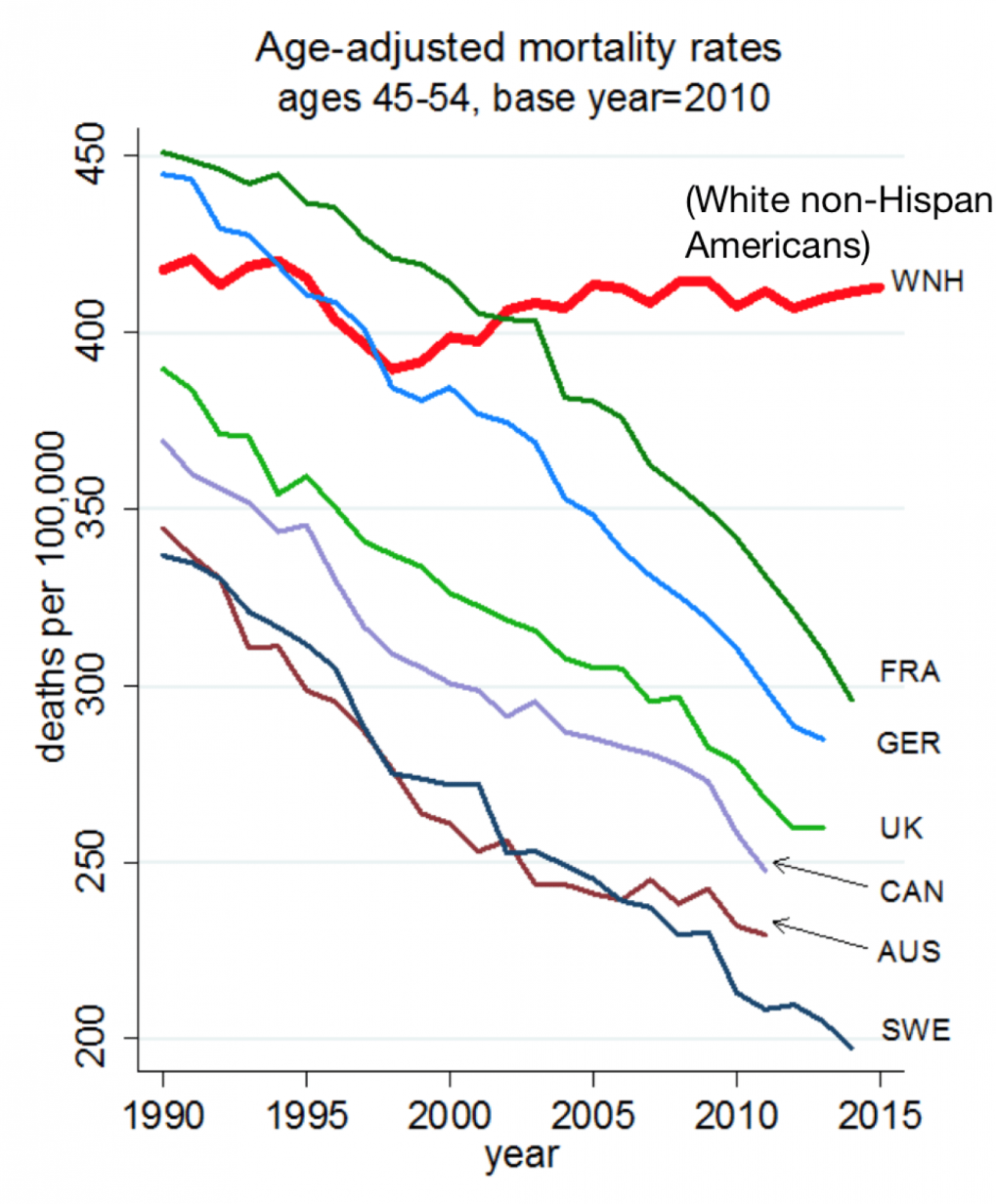
Selection effects are very real (and John Bound is one of the best empirical economists out there). Attrition from the non-college group is important. But as Zumbrun points out, once you lump all white Americans together - which totally eliminates the education selection effect - the mortality increase remains. Just look at this graph from the 2015 paper:

USW is all U.S. whites age 45-54, independent of education. USH is U.S. Hispanics. The rest are other countries - France, Germany, the UK, Canada, Australia, and Sweden. An age-adjusted graph from the more recent paper (which takes into account aging within this group) looks the same.
This graph shows two striking things. First, around 2000, the trend for middle-aged U.S. whites - all educational groups combined - stopped going down and started going up. Bound et al. might not say that qualifies as a "dramatic" increase, but it is clearly an increase, and that fact has nothing to do with education selection effects.
Second, and even more importantly, the USW trend post-2000 is markedly, hugely different from the trends for all other countries AND all other racial groups (though U.S. blacks are not displayed on the graph for some reason, Case & Deaton report that their mortality rates have also been trending downward).
This trend difference is far more important than the absolute change in mortality. It means that while good things are happening throughout the developed world that are causing mortality to fall for almost everyone, U.S. whites are being left out of this trend. Geronimus, Harris, and other critics spill a lot of ink over whether the USW trend is really upward or flat, but this distracts from the real issue, which is the big difference between U.S. whites and everyone else in the developed world.
In my opinion, if Case & Deaton made a mistake, it was to put too much emphasis on education, and not enough emphasis on this stark difference in international and racial trends.
Gelman and Auerbach's Critique
Gelman and Auerbach's Critique
OK, so let's get to Gelman's critique. Whereas Harris and Geronimus are essentially criticizing Case & Deaton for disaggregating the data too much by education level, Gelman & Auerbach are criticizing them for aggregating the data too much by race. Gelman & Auerbach have created an enormous database of mortality graphs for Americans of every conceivable combination of race, age, gender and geographical location. They find that there's considerable heterogeneity within U.S. whites - for some subgroups, mortality has been falling.
That's interesting and cool. But it doesn't invalidate the result, as Slate's overzealous headline writer seems to think. Disaggregating just gives us clues for where to look to explain the main result.
Disaggregation also distracts from the key issue of trend comparison. Gelman & Auerbach, like Harris, and like Bound et al., focus on whether the U.S. white mortality trend - or the trend for this or that subgroup of U.S. whites - is rising, falling, or flat. But the key takeaway from Case & Deaton's research is that U.S. whites aren't sharing in the mortality decline that U.S. nonwhites and Europeans are all enjoying. Gelman & Auerbach don't display any data for European countries, and they don't display demographically matched U.S. whites and nonwhites on the same graphs, making it hard or impossible to do the kind of visual trend comparison that is so easy to do in the Case-Deaton graph above.
Ironically, at the end of their Slate article, Gelman & Auerbach make a statement that relies heavily on exactly the type of aggregation that they criticize Case & Deaton for doing:
Of course, there is one simple story the data does seem to confirm: Minorities still have significantly higher fatality rates than white Americans. But that’s not news.
That might or might not still be true if you add up all U.S. minorities. But for Hispanics, it's false, and has been false for many years. Here's a Case-Deaton's graph for one age cut that illustrates the point. Compare the line for "White non-Hispanics (all)" to the line for "Hispanics":

It's also not true for Asian-Americans. Both Asians and Hispanics have lower mortality than their white counterparts. So by saying "minorities still have significantly higher fatality rates than white Americans", Gelman & Auerbach are rather hilariously failing to disaggregate. (From a quick look at CDC data, they also might just be plain wrong).
Why All The Critiques?
Why All The Critiques?
So why are people tripping over themselves to launch attacks on Case & Deaton? It's pretty obviously politics. Here are some excerpts from Harris' post:
[Some] have suggested that the Dems have to renew their focus on white working-class men if they want to win. In this view, liberals have become distracted by so-called “identity” issues like feminism, Black Lives Matter, transgender bathroom access, and the musical Hamilton, thus alienating the underserved voters Donald Trump was then able to nab. Underlying this argument is a series of reports on the immiseration of the white working class and its members’ increasing tendency to die...
[H]ow will this report be understood? I’d wager it’s something like the Brookings blog headline: “Working Class White Americans Are Now Dying in Middle Age at Faster Rates Than Minority Groups.” I asked Geronimus if that was, to her understanding, a true statement: “I think that’s misleading, I really do. Oh boy,” she laughs, “there’s so much wrong with that. That headline makes it sound like problems are worse for white Americans than black Americans.” The narrative is wrong, but it’s not the first time Geronimus has heard it since the election. The Case and Deaton paper, she says, fits conveniently in this story, and it’s one she fears Americans are primed to believe...
In [Case and Deaton's] graphs, white lives literally count more, and black lives less. But whether in health, income, wealth, or educational attainment, American white privilege is still very much in effect, and no statistical tomfoolery can change that.
In any case, it's clear that a lot of the eagerness to trash Case & Deaton's results comes from political reasons.
Is focusing on increasing white mortality a way to preserve white privilege and ignore the problems of black Americans? Maybe. I don't know. Personally, I'd think results like Case & Deaton's would help convince white Americans that the problems of black America aren't due to any unique pathology of black culture, and that white and black Americans are in the same boat together. I'd think it would be a powerful corrective to the poisonous Republican narrative that only black Americans need government help. But again, I'm no expert on how data will get used to create narratives (and I'm not sure anyone is an expert on that).
But anyway, the critiques of Case-Deaton are overdone. Maybe Case & Deaton should have focused less on disaggregating by education, and more on disaggregating by gender, age, and region. But those are quibbles. The main results are real and important.
Update 1 - More About Selection Effects
A couple people, after reading this post, asked me "OK, but did Case & Deaton ignore the selection effect, or not?". The answer is: They certainly didn't make any dumb mistakes. They intentionally ignored it, and they had their reasons. But it really doesn't matter, because I think the whole education issue is far less important than the key result.
Let me explain.
Case & Deaton obviously knew about the selection effect. They cited and explained Bound et al.'s paper, and they also mention the selection effect later in their own paper. But they intentionally don't try to take it into account.
Why not? Well, suppose you think of education as a drug that prevents mortality - kind of like statins. Case & Deaton seem to think of it this way. Now suppose that in 1990, 50% of people take statins, and in 2010, 75% of people take statins. And you observe that for the cross-section of people who don't take statins, mortality increased from 1990-2010.
There's obviously a selection effect here. The people who shifted from not taking statins to taking statins between 1990 and 2010 were probably richer than those who didn't make the shift - and, hence, likelier to have healthier lifestyles. So some of the increase in mortality among the "doesn't take statins" group will come from the changing composition of this shrinking group. That's the selection effect.
But does that mean you should correct for this bias by making sure your comparison groups represent 50 percent of the population in both 1990 and 2010? That's like what Bound et al. do. But that will mean putting some statin-takers in with the "no statins" people in 2010! Suppose you do this, and you find that once you do this, mortality for the "lower statin-taking" half of the population remains unchanged between 1990 and 2010. You say "Whew, once we control for selection effects, the lower-statin group didn't actually see a rise in mortality."
But a lot more of the people in that "lower" group take statins in 2010 than in 1990! In your effort to control for composition effects, you've forced yourself to ignore some of the beneficial effect of statins. If they hadn't started taking statins, their mortality probably would've gone up instead of staying constant!
Which method is right? Should you ignore composition effects, or partially ignore treatment effects? It depends on what you think is important, the treatment effect or the overall outcome. Bound et al. think the overall outcome is important, so they use percentiles. Case & Deaton think the treatment effect is important, so they use statin...er, education groups.
And what I'm saying in the post above is that I think neither of these things is really that important compared to the main finding, which is the trend comparison. I'm saying "Who cares? All those French and German and British and Canadian and Australian and Hispanic-American people over there are getting a lot fewer heart attacks, statins or no statins!" The trend comparison, I believe, is the big takeaway from the Case-Deaton paper, and the education issue is a bit of a sideshow.
Hopefully that clears that up.
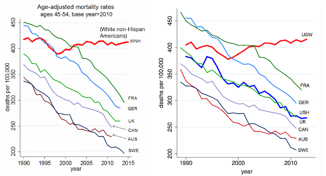
Update 2 - Age Adjustment
In the comments, Andrew Gelman brings up age adjustment. I mentioned that earlier, but just so you can see, here are the age-adjusted and non-age-adjusted versions of the Case-Deaton mortality comparison charts:
Update 1 - More About Selection Effects
A couple people, after reading this post, asked me "OK, but did Case & Deaton ignore the selection effect, or not?". The answer is: They certainly didn't make any dumb mistakes. They intentionally ignored it, and they had their reasons. But it really doesn't matter, because I think the whole education issue is far less important than the key result.
Let me explain.
Case & Deaton obviously knew about the selection effect. They cited and explained Bound et al.'s paper, and they also mention the selection effect later in their own paper. But they intentionally don't try to take it into account.
Why not? Well, suppose you think of education as a drug that prevents mortality - kind of like statins. Case & Deaton seem to think of it this way. Now suppose that in 1990, 50% of people take statins, and in 2010, 75% of people take statins. And you observe that for the cross-section of people who don't take statins, mortality increased from 1990-2010.
There's obviously a selection effect here. The people who shifted from not taking statins to taking statins between 1990 and 2010 were probably richer than those who didn't make the shift - and, hence, likelier to have healthier lifestyles. So some of the increase in mortality among the "doesn't take statins" group will come from the changing composition of this shrinking group. That's the selection effect.
But does that mean you should correct for this bias by making sure your comparison groups represent 50 percent of the population in both 1990 and 2010? That's like what Bound et al. do. But that will mean putting some statin-takers in with the "no statins" people in 2010! Suppose you do this, and you find that once you do this, mortality for the "lower statin-taking" half of the population remains unchanged between 1990 and 2010. You say "Whew, once we control for selection effects, the lower-statin group didn't actually see a rise in mortality."
But a lot more of the people in that "lower" group take statins in 2010 than in 1990! In your effort to control for composition effects, you've forced yourself to ignore some of the beneficial effect of statins. If they hadn't started taking statins, their mortality probably would've gone up instead of staying constant!
Which method is right? Should you ignore composition effects, or partially ignore treatment effects? It depends on what you think is important, the treatment effect or the overall outcome. Bound et al. think the overall outcome is important, so they use percentiles. Case & Deaton think the treatment effect is important, so they use statin...er, education groups.
And what I'm saying in the post above is that I think neither of these things is really that important compared to the main finding, which is the trend comparison. I'm saying "Who cares? All those French and German and British and Canadian and Australian and Hispanic-American people over there are getting a lot fewer heart attacks, statins or no statins!" The trend comparison, I believe, is the big takeaway from the Case-Deaton paper, and the education issue is a bit of a sideshow.
Hopefully that clears that up.
Update 2 - Age Adjustment
In the comments, Andrew Gelman brings up age adjustment. I mentioned that earlier, but just so you can see, here are the age-adjusted and non-age-adjusted versions of the Case-Deaton mortality comparison charts:
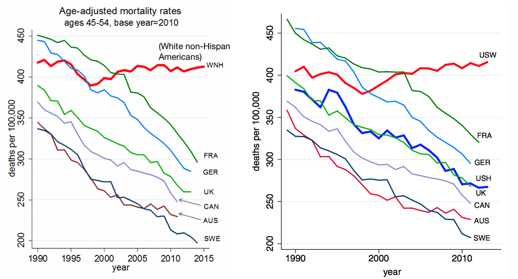
Can you see a difference?? The red trend line, for U.S. whites, looks almost the same, while every other trend line still falls steadily and dramatically.
In fact, adjusting for age makes the comparison with European countries - i.e., what I think is the central result of the paper - even more stark. It also illustrates why obsessing over whether the red line goes a little bit up, a little bit down, or stays flat is a total distraction - the real point is that every other trend line goes strongly down. (Annoyingly, U.S. Hispanics aren't on the age-adjusted chart, but you can see it's not going to make much difference.)
Update 3 - Dual Y-Axis Graphs
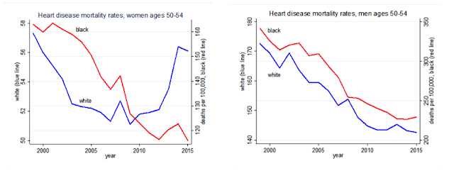
Earlier, I made fun of Harris for saying that "white lives literally count more" than black lives in a Case-Deaton graph. But a commenter explained what Harris meant - he was complaining about dual y-axes. Here's the graph in question:
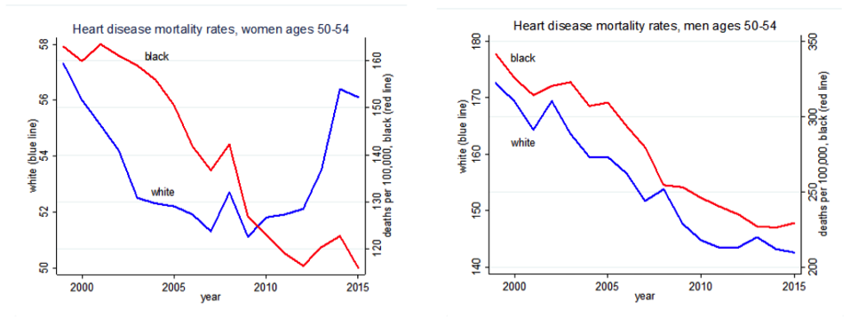
Harris is actually right - the y-axis for black mortality is much more compressed than the y-axis for white mortality. Because of dual y-axes, white lives do literally count for more. This is, indeed, a crappy graph.
BUT, it's a crappy graph because it massively understates the size of the black mortality decline. If the y-axes had the same scale, you'd see a blue line (for white mortality) that stayed just about flat, and a red line (for black mortality) that zoomed downward. In other words, making white lives count the same as black lives on this graph would show black people doing a lot better than they were before, and white people not doing a lot better than they were before. That seems like exactly the message that Harris doesn't want to send. So I'm not quite sure why Harris is complaining. Anyway, the big takeaway from this graph is: Don't make dual y-axis graphs.
Thanks for the clarification! My take on when to disaggregate and how. The main Case & Deaton result you point to refutes the common sense theory that increasing wealth of all countries will help everybody live longer. The stagnation of mortality rates among whites Americans of middle age is a refutation of that. Why the exception? Well, what data you'd want to look at further, and what is important to disaggregate will depend on what alternative explanations you have in answer to the Why? The best tests depend on what you want to test.
ReplyDeleteAnother composition effect I'm curious about is Hispanics changing their self-identification to white. I know this depends on how you ask the questions, but here is some discussion for the census:
ReplyDeletehttps://www.nytimes.com/2014/05/22/upshot/more-hispanics-declaring-themselves-white.html
This may be related to the Gelman-Auerbach critique.
This infuriates me as the vast majority of Hispanic people are white vs Hispanic afro-carribean who are generally not.
DeleteDitto. Almost makes Census data on Hispanics useless IMO
DeleteThe vast majority of US "Hispanics" are Mexican, and the vast majority of them are Mestizos, mixed race people, with generally the Amerindian component larger than the European. So, no, Unknown, you are wrong.
DeleteBarkley Rosser
The question that occurs to me is, if these are deaths of despair why are whites more in despair than blacks? In absolute terms, blacks have more to despair than whites. It seems whites are in despair because things aren't the way they used to be (make America great again?) -- and/or because they can no longer convince themselves they are different from blacks.
ReplyDeleteDeaths of despair isn't a simple product of how "objectively" bad you have it in economic and caste-ish terms. Suicide rates are generally higher in the developed world, for instance, and black Americans have lower suicide rates than whites (but Native Americans have higher than white Americans again).
DeleteNow this is just my speculation, but I think that suicide, and maybe some death of despair things that are close to suicide (such as drug overdoses), come from a disconnect between what's expected of you and what you're actually capable of.
I know the feeling that things are grim and unlikely to improve. It's a bad feeling. But that feeling is not despair. Despair is how you feel when you're given a plastic spoon to dig through a brick wall, and your wife and child looks at you with pleading eyes, and you know that you're going to fail them. (And the onlookers say you're just upset because you didn't get a golden spoon - as if that would have been any better for the task at hand).
It's hard to think of any reason why Hispanics should have a lower mortality rate than White Americans. White Americans are wealthier and have far better access to health care.
ReplyDeleteThe most likely thing to me is that race is being mis-classified at death so that "White" is the default classification when there is no further, timely, information.
It's reasonably easy to tell Blacks from Whites without information from informants but I would think that it would be hard to tell Hispanics from other European derived Whites.
This has been a major question in studies for the last several decades. In 2004 there was a report that life expectancy for Hispanic Americans was 10 yrs greater than white Americans when controlled for health care access. There is more recent evidence that this difference disappears for 2nd and 3rd generation immigrant hispanics and basically matches the rest of the white population adjusted for income/health care access.
DeleteHas anyone looked at something similar to the Roseto Effect, where it was the transition to the American lifestyle (and keeping up with the Joneses stress) that wound up being far more unhealthy than things like diet and lifestyle and occupation?
Deleteand long as we are just guessing, my guess would be because things have totally collapsed in the rural areas of the country which are disproportionally white.
ReplyDeleteNoah:
ReplyDelete1. Your first graph above is wrong for the U.S. because it is not age adjusted. After age adjustment the U.S. curve is flat; it does not go up. Plotting mortality rates without age adjustment is something like plotting nominal prices without adjusting for the consumer price index: you can do it, but it doesn't typically mean what you think it means. For more on this, see my paper with Auerbach: http://www.stat.columbia.edu/~gelman/research/unpublished/age_adj_letter_4.pdf or my several zillion blog posts on the topic. The increase in the U.S. curve of that figure is entirely explained by the increase in average age over the cohort during that period. The right thing to look at is the age-adjusted trend, and you should also follow standard practice among all demographers, actuaries, etc. and break it up by sex.
2. Your second point is correct. It was misleading for us to write, "Minorities still have significantly higher fatality rates than white Americans." The correct statement is, "Black Americans still have significantly higher fatality rates than white Americans." Comparing death rates of Hispanics to non-Hispanic whites is not so clear, as the differences vary by age categories. So it's cleaner for us to just say blacks rather than minorities in that sentence.
3. Regarding the education comparisons, here's a first place to look regarding selection bias: http://andrewgelman.com/2017/01/19/29597/
This is actually an issue I raised in my very first post on the topic, over a year ago: http://andrewgelman.com/2015/11/06/correcting-rising-morbidity-and-mortality-in-midlife-among-white-non-hispanic-americans-in-the-21st-century-to-account-for-bias-in/
our first graph above is wrong for the U.S. because it is not age adjusted.
DeleteHa. Interestingly, I initially put the age-adjusted graph up by accident, and switched it later. The graphs looked so similar I couldn't tell the difference.
But just to satisfy you, I added a further update comparing the two graphs, and showing why age adjustment doesn't matter (or actually strengthens the core Case-Deaton result).
Your second point is correct. It was misleading for us to write, "Minorities still have significantly higher fatality rates than white Americans." The correct statement is, "Black Americans still have significantly higher fatality rates than white Americans."
I figured as much. Slate should just change that, no biggie.
Noah:
DeleteI agree (and have written many times) that Case and Deaton's comparison between countries holds up just fine after age adjustment. They just need to stop saying that the death rate of whites in this age group has been increasing. The death rates of whites in this age group has been flat in recent years, in fact declining slightly for men and for women outside the south, and rising only for women in the south. So, again, "age adjustment doesn't matter" much (I wouldn't say it doesn't matter at all), except for those commentators who insist on talking about the increasing mortality rate of whites (or, even worse, white men).
I just think the question of whether it's increasing, decreasing, or flat is a total distraction from the real point. I mean, whether it's "increasing" or "decreasing" depends on the reference year anyway. Present progressive tense implies a trend, but any trend that exists in that series isn't very steep. So who cares?
DeleteThe important part is the trend comparison - not just with other countries, but with nonwhite groups in the U.S. U.S. Hispanics started off with lower mortality and have trended strongly downward. U.S. Blacks started off with higher mortality and have trended strongly downward. U.S. white mortality is not trending strongly downward.
To me, that is the big fact and the essential point.
Oh, and as I wrote in the post, I think disaggregating U.S. white mortality by gender, region, etc. is interesting, but unless comparisons are made with matched European and nonwhite American groups, whether each cell is "increasing" or "decreasing" seems uninteresting to me.
DeleteNoah:
DeleteI think your argument is more with Case and Deaton than with me. They're the ones who led off their original paper with the sentence: "This paper documents a marked increase in the all-cause mortality of middle-aged white non-Hispanic men and women in the United States between 1999 and 2013." Which is just wrong. Or, as wrong as writing that there has been a marked increase in the cost of some product, when presenting the change in real rather than inflation-increased dollars. At every point during this discussion, Case and Deaton had the opportunity of making your point, that the comparison to other countries and other groups is the big story, not the direction of the trend among whites. At every point during the discussion they've had the opportunity to write, "any trend that exists in that series isn't very steep. So who cares?" But they did not do so, which has left me about as annoyed as you might possibly be if someone repeatedly misrepresented a price change by not adjusting for inflation.
Beyond this, on the substance, it's standard practice to break up mortality rates by sex. Not breaking up changes by sex is simply not a serious option. You may personally not be interested in looking at the trends among men and women separately, but that's really your idiosyncrasy. Breaking up by sex is a freebie and there's no good reason to merge the sexes when looking at these trends.
Look at, say, Figure 2c here: http://www.stat.columbia.edu/~gelman/research/unpublished/age_adj_letter_4.pdf Death rate is going up for women and down for men. That's a story, and it just jumps out from the data if you do the completely standard steps of age adjustment and looking at each sex separately. These are not arcane tricks; they're standard practice in demography and actuarial science.
I think the sex difference, while interesting, doesn't detract at all from the main finding, which is about trend comparison.
DeleteBut I agree that Case & Deaton could have done a better job of emphasizing this.
If one is interested in understanding the trends and implementing policy to alter them, it seems pretty important to know that the increase in mortality rates for whites in this age group is being driven by increases in women's mortality.
DeleteThe age-adjusted 45-54 WNH mortality rate is still pretty clearly above its late-1990s trough, so I'm having a hard time understanding the counter-argument to C-D that it's been "flat". Perhaps that's a fair evaluation of the trend *since the early-2000s*, but then that would entirely ignore the level shift in the late-1990s. Here's a highly sophisticated trend calculation illustrating my point:
Deletehttp://imgur.com/bAvo48T
If one is interested in understanding the trends and implementing policy to alter them, it seems pretty important to know that the increase in mortality rates for whites in this age group is being driven by increases in women's mortality.
DeleteYes, BUT, the difference in trends between U.S. whites and all other groups is being driven not just by women but by men as well.
The age-adjusted 45-54 WNH mortality rate is still pretty clearly above its late-1990s trough, so I'm having a hard time understanding the counter-argument to C-D that it's been "flat".
Yep, exactly. Whether it's "rising" or "falling" depends entirely on the choice of reference year in this case. Which is why I think Andrew's focus on this is misplaced.
The standard of "does it detract from the main finding" isn't useful in this case. This debate revealed three things: 1. Deaton and Case issued important work; 2. They misrepresented that work as showing an increase in white mortality since 1999; 3. The media largely parroted the misrepresentation.
DeleteThose latter points are also important! Good scientists should be discouraged from overstating otherwise good research, and good journalists should be discouraged from parroting otherwise good scientists. And "good" doesn't mean anything unless we are holding people to standard.
They misrepresented that work as showing an increase in white mortality since 1999
DeleteNope, false, that's wrong. White mortality DID increase since 1999. Whether you think that was the right emphasis or framing is another matter, but it's correct.
Media outlets that I've seen have done a great job of accurately representing Case & Deaton's key findings.
BTW the low death rate of Hispanics is often called the 'Hispanic Epidemiological Paradox' among demographers. The difference is greatest among foreign born and older hispanics. Second generation Hispanics have much the same mortality profile as the white population as a whole. The health researchers suggest the largest difference is probably driven by the significantly lower levels of tobacco and alcohol use among hispanic immigrants especially older immigrants.
ReplyDeleteThe second major effect is a selection effect where immigrants are generally healthier. Mexican immigrants are as much as 1.5 in. taller to comparable persons who did not immigrate. There is also a small effect of returnees also being less healthy.
The irony is that although the hispanics live longer they are much more likely to be disabled.
Minorities actually have lower mortality rates in the 45-54 age group than non-Hispanic whites, which can be easily deduced from the fact that mortality rates for that age group is lower for Americans of all races than for simply non-Hispanic whites. Data can be queried at CDC Wonder.
ReplyDeletehttps://wonder.cdc.gov/mcd-icd10.html
This seems to actually be true - checking that database, restricting the queries to only 2015 (the most recent year they have full data for), the death rates it gives for the 45-54 age group are:
DeleteTotal population: 174494 deaths/43188161 population = 404.0 deaths per 100000
Non-Hispanic Whites: 118578 deaths/28341672 population = 418.4 deaths per 100000
By inference, everyone except non-hispanic whites: 55916 deaths/14846489 population = 376.6 deaths per 100000
Looking a bit further, this thing where non-Hispanic whites have a higher death rate than the US total average is present in most other age cohorts as well: 25-34, 35-44, 65-74, 75-84 and 85+ (but not 55-64) all show the same pattern.
Also, asking it to do "Age-Adjusted Rate Per 100000" across all ages gives a death rate of 753.2 for the non-hispanic whites and 733.1 for the total population.
I'm not sure what "white lives literally count more" means - it seems to be a flagrant misuse of the word "literal".
ReplyDeleteIn [Case and Deaton's] graphs, white lives literally count more, and black lives less.
It means they used different axes on the same graphs for black and white rates.
Mmm, yeah...but if they put them on the same y-axis and indexed each to the starting point, the red line (for black ppl) would plunge like crazy while the white line pretty much held steady - in other words, it would show a much better trend for blacks than for whites. Why Case & Deaton didn't do this (as they did for their other comparisons) is beyond me.
DeleteNoah,
ReplyDeleteAs long as we're on the topic of issues created by aggregation, will you please stop aggregating everything you see that you don't like from anyone who calls himself a republican into Republican racism?
Statements like "poisonous Republican narrative that only black Americans need government help" are ridiculous and insulting.
The left already has, in Paul Krugman, a popular blogger willing to label all Republicans as racists. How about you do something else?
Statements like "poisonous Republican narrative that only black Americans need government help" are ridiculous and insulting.
DeleteNo it isn't, this is what the GOP has been doing as long as I've been alive (and longer). It's how they manage to get so many people to oppose policies designed to help them.
http://scholar.harvard.edu/files/alesina/files/423__0332-alesina11.pdf
Did you actually read that whole paper? Its conclusion:
Delete"Our bottom line is that Americans redistribute less than Europeans for three reasons: because the majority of Americans believe that redistribu- tion favors racial minorities, because Americans believe that they live in an open and fair society and that if someone is poor it is his or her own fault, and because the political system is geared toward preventing redistribu- tion. In fact, the political system is likely to be endogenous to these basic American beliefs."
Did see anywhere that said that Republicans are racists or that they believe only black people need government help.
Shall I indiscriminately label all Democrats, including you, with the typical liberal "narrative" as you call it?
Yep, it's a very important paper.
Delete"the majority of Americans believe that redistribution favors racial minorities" <-- This is the key, right here. Lots of lower-earning white Americans would benefit from redistribution. It's because of this belief, right here, that many don't realize it.
Great...."The majority of Americans"....so stop blaming it solely on Republicans and their "narrative"!
DeleteBy the way...the fact is, as the paper says, that redistribution DOES favor minorities in the US so Americans SHOULD think that. If they don't like redistribution because of the race issue, it means they are RACISTS; it doesn't mean they are Republicans.
Logic 101- Just because there are Republicans that are racist, doesn't mean that the majority are, or that that is why they don't like redistribution. The paper you cited shows several reasons the U.S. doesn't distribute more which have nothing to do with race.
Quite a few of us just believe in limited government Noah. I guess that's really hard to understand.
@TheDonk:
Delete"the majority of Americans believe that redistribution favors racial minorities"
Do you really think it's necessary to add "and they really hate that" to the end of this?
"Lots of lower-earning white Americans would benefit from redistribution. It's because of this belief, right here, that many don't realize it."
DeleteDo any of you "reality-based" wonks/dweebs ever think that maybe people who could benefit from certain Democratic policies may still feel a loss of dignity from it, & would just prefer a solid career? Of course I'm sure this is "irrational" and "illogical" as opposed to just regular human nature.
Sure thinking about racial minorities is a part of it, but you always hear about the Tea Party/similar types drawing a distinction between "earned entitlements" (SS, Medicare) and what they think are handouts. It's a difference in type, not just people thinking black people are lazy or whatnot.
If you ask me the pathology is all in the unique 6% union density US labor market. US workers black or white wont (can't possibly) build their lives around $10 an hour jobs -- today's dark glass ceiling.
ReplyDeleteAfter I explained the spinning wheels US labor market to my late brother John he came back with: Martin Luther King got his people on the up escalator just in time for it to start going down for everybody.
Blue collar whites are dropping into unhealthy life styles for the same reason 100,000 out of my guesstimate 200,000 Chicago gang-age males are in (many in and out) of drug dealing street gangs. Neither desire nor moan for up-to-date kitchens or two SUVs in the garage.
LEAST OF ALL ARE EITHER INTERESTED IN $10 AN HOUR JOBS. They don't need to bring back manufacturing -- they just need $20 an hour jobs.
The bottom 45% now take 10% of overall income -- down from 20%. That is real problem and until we rebuild union density it will be the source of all other problems. Check out the union density (or effectiveness) in all those other countries on the graph.
[cut-and-paste]
Old saw is that federal preemption cuts states out of protecting collective bargaining rights. But just because Congress never included felony prosecution for union busting doesn't mean Congress did not want anyone else to -- and would not have mattered if Congress did not want it. All state protection does is reinforce the (toothless) federal set-up.
Congress could not constitutionally pass a law that states may not protect bargaining (OF ANY KIND!) from being muscled. No more than Congress may prevent states from making their own minimum wages (which Republicans would have tried a long time ago if it were possible).
Jimmy Hoffa said: "A union is a business." There is no reason one business (owner) should have carte blanche to bust the bargaining power of another business (labor) in a democracy.
Progressive state to start with: WA, OR, CA, NV, MN, IL, MA, NY, MD, etc.
And don't forget to get around to centralized bargaining (like the Teamster's National Master Freight Agreement -- or, where else, German, Denmark, etc.). Supermarket and airline workers (especially employees under RLA) would kill for (legally mandated?) centralized bargaining.
Three issues strike me for further investigation:
ReplyDelete1. Are the charts the same once adjusted for earning power / wealth (I assume education correlates tightly with earnings / wealth but would want to evidence it)
2. How is it impacted by access to healthcare. Might be too early, but would be interesting to see if Obamacare has made an impact. Many of the European countries referred to have forms of universal healthcare. [I wonder if the ex-service men who are covered by the VA would also provide some control data for the 'access to healthcare' hypothesis?]
(Would also be great to plot mortality vs distance to medical facilities.]
3. Another 'assumption' (or bias?) that I have is that BMI (body mass index) is related to education; possibly as a lot of manual 'working class' (acknowledging the discussion of the term) have vanished. Would be interesting to see (if possible) if BMI / obesity (and implicitly diabetes) has an impact.
I appreciate getting any of the above data is hard.
Roddy
The other thing you left out of your defense of Case and Deaton, is that the increase in white mortality is driven primarily by women and not men. See below
ReplyDeletehttp://healthaffairs.org/blog/2015/11/10/to-understand-climbing-death-rates-among-whites-look-to-women-of-childbearing-age/
I'm not sure what "white lives literally count more" means - it seems to be a flagrant misuse of the word "literal".
ReplyDeleteI agree with you & Gelman that there is clearly something going on in the US, especially when you look at the international comparison. But that phrase is, in my view, a completely adequate summary of the horrible, terrible, no-good appendix graphs 5 c)&d) in Casey&Deaton that, indeed, literally measure black and white mortality rates on different scales. Stuart Buck summarized this nicely in Tweet form yesterday: https://twitter.com/StuartBuck1/status/847104688562548736
One can take different views about how important this is. The graphs themselves are not crucial for their argument. For me, though, making such a graph and putting it into a Brookings paper is a signal of a level of either malfeasance or incompetence that I'm not willing to trust any of the rest of their analysis much. Thankfully there are a sufficient number of reanalyses that I _do_ trust, so I have a reasonable sense of which of their findings I think holds.
But again, that sentence you quote is a completely accurate description of those two graphs.
Your update 3 is only partly correct. Yes, the scale of the y-axis is more compressed for black mortality than white mortality, and yes, this undervalues the relative decline in black mortality rates. But the figure is ALSO crappy because it uses two different offsets from zero! Showing the data this way gives the impression that mortality in white women is now worse than in black women – displaying it correctly would make it clear that mortality for black women is still more than twice as high as for white women. It seems to me that this is a particularly important way in which white lives count for more here, I'm surprised you don't comment on that.
ReplyDeleteIn fact the more I look at it, the more I am amazed at just how crap that graph is. It really is terrible – it could almost be exhibit 1 in those articles about misleading graphics ...
My update 3 is completely correct! :-)
DeleteCase & Deaton have plenty of graphs, with and without offsets. An earlier one I posted has no offset.
Graphs with offsets (or which index to a base year) are good for comparing trends. Graphs without offsets are good for showing levels. Case & Deaton have both kinds. Which is good.
But dual y-axis graphs pretty much always suck, unless the units are completely incomparable (e.g. kilowatt-hours on one axis and number of people on the other, or something).
It is completely correct about the issue it does mention, but it doesn't mention what I think is the most egregious error. Graphs with offsets are certainly useful, but dual y-axis graphs with two different offsets suck even more than dual y-axis graphs in general.
ReplyDeleteI agree that this particular Case-Deaton graph is useless. About whether dual y-axis graphs suck worse with or without offsets...I'm not sure there's a general answer. In this case, I'm not even sure what point Case & Deaton were trying to make with that graph, so I'm not sure what they should have done instead. Best to just leave that one out completely.
DeleteThank you for being acting as a fair minded neutral observer. Your reputation is deservedly high. Unfortunately politics screws everything up. There are thousands of empirical economics papers posted every year but how many of them get the intense and in some cases vicious criticism that this paper has? Suddenly everybody cares so much about selection bias...
ReplyDelete"Is focusing on increasing white mortality a way to preserve white privilege and ignore the problems of black Americans?"
ReplyDeleteNo, in my opinion. We should be able to care about multiple things at once. Its one of the reasons why I have a problem with Black Lives Matter. Just calling it that makes seem like injustice and and police abuse only occur against blacks. Even if they occur at a higher rate against blacks, its not like their aren't any whites, Asians, Jews, hispanics or others who aren't getting abused. The movement should be focused on protecting all lives from injustice and abuse, not just the one group that happens to be the most adversely impacted.
That's a dumb reason to be against BLM (although it's an issue that also involves Hispanics, yeah.) The real issue with them is that, for as much as white liberals talk about how black-on-black crime is a separate matter you shouldn't bring up as a comparison, they're only right in a limited sense. Violence from authority figures is obviously a fundamentally different issue from street violence, but the latter issue is part of the explanation of why cops are trigger-happy/sometimes fuck up in certain situations. Sure some are just assholes, but the whole narrative of Systemic Racism (tm) and all cops in these situations as racist sociopaths is moronic.
DeleteUm - I don't think that systemic racism means that cops are racist sociopaths, but rather that big systems lead cops to make judgement about black males that they would not make without systemic racism. I hear this all the time - that systemic racism = individual racism. I don't think that follows, and certainly don't think that many or most cops harbor overt racial bias. However, their training, systems and social systems result in outcomes that are unfair to minorities and we should be trying to combat these biases.
DeleteNoah this is a great article. Two levels: what the topic deals with and the "caveats" implicit in statistical analysis of "real world" data. As a relatively frequent visitor to the US (admittedly mainly the coasts) the trends shown here really are puzzling to outsiders. What is happening???
ReplyDeleteI don't think this overall addresses my personal critique - the presentation of all these analyses are tilted to create the impression that blacks have it 'worse' than whites. That's the product of focusing on changes in mortality. But mortality for blacks is still a lot higher than for whites!
ReplyDeleteElsewhere I saw C-D make the claim that because white mortality has risen while it has fallen for blacks this implies some individual specific factor that only afflicts whites. But that seems absolutely nonsensical. The differing pattern of the two shows that there exist factors that affect blacks, sure, but the changes and raw numbers are so large that it could easily be the case that this is all the result of income or price changes and just happen to be masked for blacks by some other factor that is more important for them.
the presentation of all these analyses are tilted to create the impression that blacks have it 'worse' than whites. That's the product of focusing on changes in mortality. But mortality for blacks is still a lot higher than for whites!
DeleteBut if you see black mortality dropping like a rock (which it has been), you should assume there's some good underlying trend going on there, and not mess with it. And if you see white mortality leveling off or drifting upward, it means there's some negative underlying trend going on there and you should look into it.
Well, the right end of the graph seems to suggest black mortality levelling off at a rate over 50% higher than white mortality. Maybe the trend should be messed with?
DeleteBut I think the wider point is the nature of the *comparisons*. Presenting the graphs as they do doesn't independently say 'there's some negative underlying trend, meanwhile there's some positive trend', rather you put these on the same graph with the absolute values removed to say 'oh this isn't right, these two lines should be parallel'. When one starts off much higher than the other, so if we want black and white mortality to converge we'd absolutely expect black mortality to have a more negative trend than white mortality.
Like you have just repeated, a persuasive message has been created. By introducing this comparison, we generate the view that trends in black mortality is okay, we need to look at white mortality. By including only graphs about white mortality due to 'despair' we generate the notion that it's despair and economic anxiety making the difference. But there's no actual reason to make this conclusion, because mortality here is a mix of other factors. One might equivalently argue that actually there's a bad trend going on in both black and white subpopulations, but that in blacks it's masked by other factors. The important points to see if this is true are just precisely the graphs and comparisons omitted. Where are the deaths from despair for the black working class?
Well, the right end of the graph seems to suggest black mortality levelling off at a rate over 50% higher than white mortality. Maybe the trend should be messed with?
DeleteIf that continues for more than a couple years, yeah, for sure.
But I think the wider point is the nature of the *comparisons*. Presenting the graphs as they do
Now, wait. Remember, Case & Deaton have a TON of graphs. They have graphs that compare rates directly. They have graphs that compare trends. They have all sorts of stuff. It's we writers who pick and choose which to pull out and display. In this post, I pulled one chart that showed trend comparisons, and another that showed levels, just to get both angles of that. But their papers have a LOT more graphs in them.
By including only graphs about white mortality due to 'despair'
Case & Deaton do have those, but I didn't present those here.
Where are the deaths from despair for the black working class?
They have some of those, I believe. Actually the trends are encouraging. Black Americans are already considerably less likely than white Americans to be alcoholics, use illegal drugs other than marijuana, and kill themselves. And the gaps are getting bigger. So the "despair deaths" were always more of a white thing than a black thing, on average.
To be fair much of my annoyance here is at the wider journalistic reporting on the paper than the paper itself, and maybe I can disentangle whose fault is what. But I do think there's issues with what is presented and focused on. Consider Figure 1.2.
Delete"Putting black and white non-Hispanics with a high school degree or less head-to-head, Figure 1.2 shows that the black-white mortality gap has closed for every five-yearage cohort between 25-29, and 50-54 year olds—due both to mortality declines for blacks, and mortality increases for whites. The racial gap in mortality among the least educated has all but disappeared."
This is all Case-Deaton say about this graph, which compares black and white HS degree, which is probably the critical apples-to-apples comparison no? What it doesn't mention is that both black and white HS degree holders show the identical increasing trend in mortality in every age group in the last five years, which encompasses 1/3 to 1/4 of the period they consider. You'd kinda think this might factor into the discussion.
Why do you (implicitly) accuse Gelman of criticizing C&D for political reasons? There is ZERO evidence for this. I read his blog regularly, and all I see is someone who is interested in eliminating bad statistical analysis from social science -- period. C&D have an interesting story to tell (US white mortality rates are flat, while similar rates are declining elsewhere), but that story wasn't sexy enough for them, so they had to tell (and a credulous media repeated) an incorrect story that "white male mortality rates are skyrocketing"(the exact words used by the Wash Post in their coverage). As usual, you are playing the role of the smug, ignorant dilettante who panders to other ignoramuses. Tell me, does that job pay well?
ReplyDeleteWhy do you (implicitly) accuse Gelman of criticizing C&D for political reasons?
DeleteI suspect that political reasons play a smaller role in Gelman & Auerbach's motivation, but the line at the end of their Slate piece indicates that there might be a little bit of politics there.
As usual, you are playing the role of the smug, ignorant dilettante who panders to other ignoramuses. Tell me, does that job pay well?
I feel like your critique is politically motivated. :D